Team Sweden (Olympic Version), by Alan:
As I promised on Saturday, here are Alan's concepts for team Sweden. We'll start with the Olympic version, which has that classic Sweden look but is modernized a bit by adding more white. It also has custom fonts for the names and numbers, as well as a curved hem stripe in the back which add to that slightly modern look. The most unique part of this concept is the logo, which puts Sweden's famous triple crown logo inside of what looks like a combination of a shield and the top of a crown. The logo also has the Swedish flag inside the triangle part of the main shield/crown thing. I love the idea of the logo, I just think this version is a bit to busy. The sleeve patch is a nice secondary logo and I like its placement on the sleeve stripes, and I also really like the Swedish flag replacing Nike's fake laces.
Grade: B
Team Sweden (World Champions Version), by Alan:
Alan also sent in this World Champions version which is more or less a simpler take on the Olympic version. The striping has been simplified by removing white, the numbers are a simpler block font, and the logo uses a simpler version of the crown and is also simplified by removing the flag from the logo. It's really just a matter of personal preference, but I prefer this simpler version over the previous concept. I also prefer the blue helmet in this concept over the yellow helmet in the previous concept.
Grade: A
Montreal Canadiens, by Jared:
We also have a second hand drawn concept by Jared. He suggests that Montreal brings back their 1919-21 jersey for the 2017-18 season (the NHL's 100th anniversary), and create a matching white version. I like the idea of using vintage jerseys for the NHL's 100th anniversary, especially if it's just for a handful of games. While I like the idea, the execution does needs some work. One of the major issues is that whatever is being used to colour these jerseys doesn't have a sharp enough tip on it. Take a look at these hand drawn concepts on Icethetics, you can see that the colouring device has a much finer tip which allows smaller details to be drawn much clearer. I'd recommend using something like pencil crayons with a sharpened tip. Another execution issue is that the colouring job looks rushed, in a lot of places the colour goes over the lines and other areas aren't fully coloured in which leaves white gaps. Taking your time while colouring in the jerseys will make the concepts look much better. My final suggestion is to use a neutral colour (like grey or black) for the outline of the jerseys.
Grade for the idea: B
Grade for the execution: F*
*Don't be discouraged by the execution grade. Everyone has problems with execution when they start making concepts, and if you put in some effort you're execution will get much better.
Have a good day!
April 29, 2014
April 26, 2014
Finland Guest Concepts
Team Finland (Olympic Version), by Alan:
We've seen international concepts by Alan for Canada and USA already, and today we get to see a couple of concepts by him for Finland (he also sent in concepts for Sweden which will be posted soon). This concept is meant for the Olympics, and like Finland's actual white jersey in the Olympics it uses Finland flag as inspiration, but in a different way. If you read my Olympic jersey review post you know that I loved Finland's flag jersey, and I also love this concept. The layout of the striping is very unique, like how the vertical stripes on the shoulder continue down to become stripes on the side panels, and how the horizontal stripes on the arm continue behind the player names. I also like the flag on the pants and the flag replacing the fake laces on the collar. The logo is good, but I wouldn't call it great, something about flag in the triangle at the bottom looks off.
Grade: A
Team Finland (World Champions Version), by Alan:
Alan's second Finland concept is meant for the World Champions, and navy blue is more prominent in this concept. These jerseys are very aesthetically pleasing, I think this double blue colour scheme looks great. The striping pattern is good looking too, but it's not as unique as the previous concept, it kind of reminds me of the Blue Jacket's current jerseys.
Grade: B
Thanks for visiting!
April 23, 2014
Penguins Guest Concept and a Wild Concept
Pittsburgh Penguins, by Jared:
This is Jared's first concept on SG-94 and it's also the first hand drawn concept on this blog. This concept is meant for the 2017-18 season. The jersey features a gold shoulder yoke with the players name in the shoulder yoke like the Hurricanes current road jersey, as well as black and gold stripes along the hem and cuffs. It also uses the Penguins' 1992-2002 primary logo as the main logo. The execution might not be as good as we're used to seeing, but that will improve with more practice. My advice to Jared is to just take your time and be patient while making concepts, if you rush too much the execution will suffer.
Grade: B (I'm just grading the idea for this concept, not the execution).
Minnesota Wild:
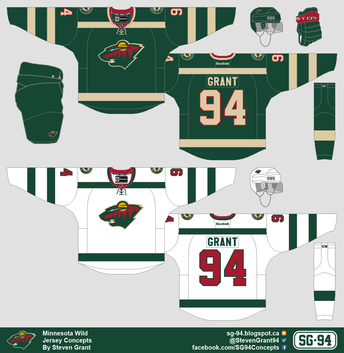
Believe it or not this concept is actually inspired by the Boston Bruins 1948-51 white jersey. I was watching a video clip of those jerseys in action and at first I didn't notice the yellow, so the jerseys appeared to be monochrome. I soon noticed the yellow, but it gave me an idea for a concept based on what the striping pattern would look like if it was monochrome. I didn't know what team I should make the concept for, but I eventually decided on the Wild (even though I like their current jerseys).
Have a good day!
April 17, 2014
Steel Drop Oilers
Edmonton Oilers Third:
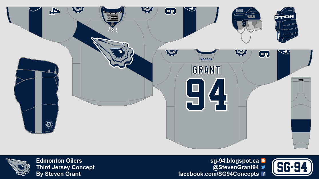
This is my entry into HJC's Steel Drop Logo Competition. I had an idea to try a grey jersey with a blue angled stripe beneath the logo, and this is the result.
Thanks for visiting!
This is my entry into HJC's Steel Drop Logo Competition. I had an idea to try a grey jersey with a blue angled stripe beneath the logo, and this is the result.
Thanks for visiting!
April 15, 2014
Two Years, Flames, and a Guest Concept
Today is the second anniversary of this blog, as the first post was on April 15th, 2012. Since then there has been 178 more posts, including 30 posts with concepts by a guest (today is one of those posts).
Celtic FC, by Ricky:
Today is also the first time there has been a concept for a soccer team on this blog. I'm probably not the best person to review this concept since I don't follow soccer at all, but I'll give it my best shot. Looking at the jerseys my first impression is that they're too busy. For the first two jerseys I'd recommend getting rid of the pattern in the armpit/shoulder area, or at least make it much more subtle. I also think the horizontal stripes would look better if they were thicker and simpler. I like the green jersey better, but I think the shade of green is too bright, just darkening it a little bit would improve it a lot. I also think the sleeve stripes on that jersey should be simplified more. On a more positive note the execution is very good, and I like some of the minor details like the trophies in the numbers. Overall these jerseys are just too busy for me, I tend to like simpler designs, but that doesn't mean these are bad, just that I don't like them.
Grade: C-
Calgary Flames Third:
I wanted to make a third jersey for the Flames that uses the shoulder logo from their current third jersey as the main logo. I decided to use angled stripes like their 2000-07 jerseys, but I used those angled stripes as a chest stripe instead of hem stripes. The rest of the concept is pretty self-explanatory.
Have a good day!
April 12, 2014
Roadrunners Guest Concept
Montreal Roadrunners, by Ricky:
For this concept Ricky brought back the Montreal Roadrunners of the Roller Hockey International league (and before today I had no idea this team or league ever existed). I really like the jersey striping, combining the Washington Capitals sleeve stripes with the Carolina Hurricanes yoke looks surprisingly good. The number font (which if I understand correctly is the MLS's current font) works really well, I think a roller hockey team should have a font that's a bit different. I also think adding blue to the logo instead of grey was a great decision, but it also makes me wish that blue was incorporated into the jerseys more. The only thing I don't like are the swirls within the hem stripe, they don't really fit with anything else.
Grade: B
Thanks for visiting!
April 06, 2014
New Blues
St. Louis Blues:
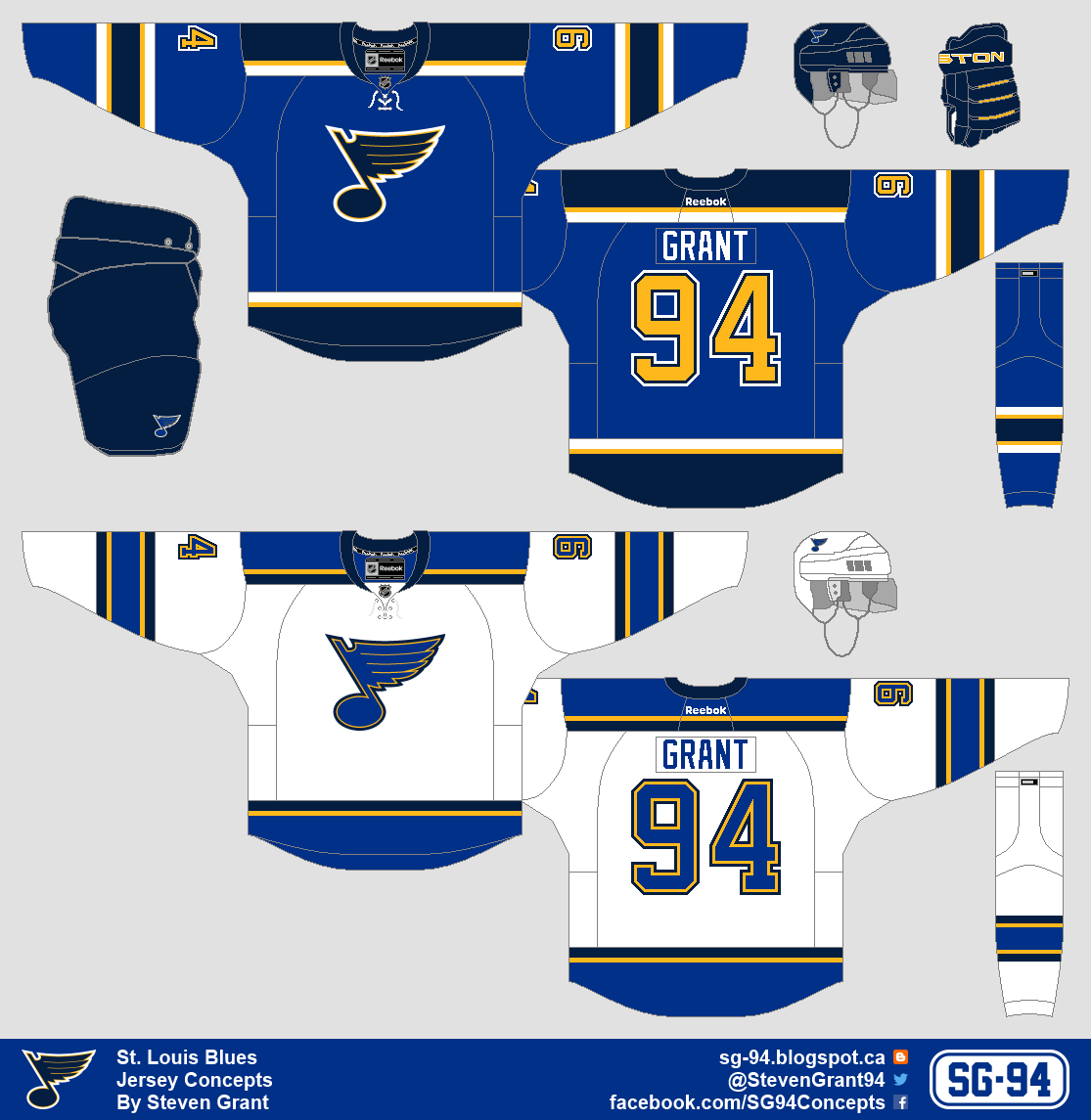
There are rumours that the Blues could be getting new jerseys next year, and possibly a new logo, which is why I made this concept. As you can see the jerseys are similar to their pre-Edge jerseys, but with some differences. I also slightly altered the logo, which you can see below.
Logo:
I changed the top of the logo from straight to curved, and I also eliminated one of the outlines.
Have a good day!
Subscribe to:
Posts (Atom)

.png)
.png)

.png)
.png)


.png)