The Olympics are over, Canada won gold in both the men's and women's hockey (yay!), and now it's time for me to post my thoughts on the Olympic jerseys. I'll try not to ramble on to much, to keep this post from getting to long.
I'll start off by saying that I was a fan of the jerseys in general. Most of the jerseys looked different than a typical hockey jersey to some degree, and I think that's a good thing. What I didn't like was that a lot of the countries looked similar. Slovakia, Germany, and the United States (white jersey) all used the exact same template. Then there were Finland's and Russia's dark jerseys that both used flags as sleeve stripes with contrasting dark yokes, and a few other examples of similar jerseys. This shouldn't happen, especially when there are only 14 teams.
One of the least popular elements of these jerseys were the "fake laces", but I actually liked the look. My favourite part of those collars was that they were always the same colour as the shoulder yoke, instead of contrasting like most NHL teams use. It created a clean and simple look, which I think looked good. Again though, I wish there was more variety, different collar styles countries could choose instead of just the one. Also, I was a fan of the shiny material used for the designs on the shoulders, but once again I wish teams had the option to use a regular shoulder logo instead if they wanted to.
Now I'll review the jerseys team by team, going in alphabetical order. Also, the photos in this post are from the Associated Press (there's a link to the article where I got each photo in the captions).
Austria:
We start off with the Austrians, who in my opinion had very solid but not terribly exciting jerseys. The white jersey was my favourite of the two because I think the contrasting yoke worked better on the white jersey, and I also liked the chest stripe.
Grade: B (white jersey), C+ (red jersey)
Canada:
As a Canadian I'm probably biased, but I think Canada had some of the better jerseys at the tournament. I loved how the home and road jerseys combined the 1972 summit series jerseys with the jerseys of the Winnipeg Falcons who represented Canada at the 1920 Olympics, and I think the black jersey rounded out the set nicely. A lot of people didn't like the stripes only on one sleeve, and I'll admit the jerseys would of probably looked better with them on both sleeves, but I certainly didn't mind how it was. It kind of made sense to have the sleeve stripes only on one side, since the chest stripe was only on one side of the jersey. The one thing I didn't like were the socks, they didn't really match the jerseys and they looked kind of awkward in my opinion.
Grade: B
Czech Republic:
If I was ranking the Olympic jerseys the Czech Republic would be right near the top, if not at the top. The white jersey was one of my favourites, it was the same style as USA's white jersey (along with Slovakia's and Germany's jerseys), but I think the Czech Republic pulled it off the best. The dark "flag" jersey was quite unique, and it looked good, but it did have a lot of white for a dark jersey. One more thing, I liked how the Czech Republic had a different number font than anyone else at the tournament. All the other countries shared their font with at least one other country.
Grade: A (white jersey), B (flag jersey)
Finland:
We go from one flag jersey to the other, and without a doubt Finland's flag jersey was my favourite jersey in the whole tournament. I loved the colours, I loved the striping created by the flag, there's really nothing I didn't like. The blue jersey wasn't bad, but it wasn't as good as the white jersey. I think the navy blue yokes made the flags on the sleeves look awkward, there was to much navy blue so close to the sleeve stripes to have no navy blue on the sleeves.
Grade: A+ (white jersey), C+ (blue jersey)
Germany:
Germany used the most overused template at the Olympics, but I think it worked for their yellow jersey, although not so much for the black jersey. The striping for the yellow jersey made sense, it goes in the same order as the German flag. The black jersey, being the reverse of the yellow jersey, obviously isn't in the same order as the flag. I also didn't like how the yellow yoke looked on the black jersey. I think the yoke on the Nike template is too big to have a light yoke on a dark jersey, I just don't like the way it looks.
Grade: B (yellow jersey), C- (black jersey)
Japan:
Japan's jerseys weren't very popular (there were
ranked last by Icethetics readers), with a lot of people calling them boring. I'll admit they weren't the most exciting uniforms, but I don't think they looked bad, I actually think both jerseys looked quite intimidating. One thing I don't get though is why Japan is written in English, why not use Japanese.
Grade: B
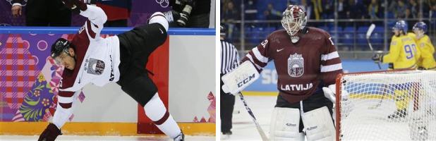
Latvia:
My opinion of Latvia's jerseys is basically the same as my opinion of Austria's jerseys, they're decent jerseys but not very memorable. I do like that Latvia didn't use a contrasting shoulder yoke on the dark jersey.
Grade: B
Norway:
Norway's jerseys were unchanged from the 2010 Olympics (besides the new jersey cut and collar), and that's not a bad thing. These jerseys, with both sleeve and hem stripes, looked the most like a traditional hockey jersey of any of the regular Olympic jerseys. I know that at the start of the post I said I liked that most of the other countries' jerseys didn't look like a typical hockey jersey, but with all the other teams trying more nontraditional designs, Norway's jerseys actually stood out the most from the rest of the pack.
Grade: A
Russia:
The host country's results at the tournament weren't very memorable, but their white jersey sure was. From the the giant eagle silhouettes on the front to the wing pattern on the shoulder, everything about this jersey was unique. I think it looked great and it looked very Russian. My only concern about the jersey was that the front had a lot of red for a white jersey, although that didn't seem to be a problem in the Olympics. I also think Russia made another good move by paring their unique white jersey with a more traditional red jersey. The Russian flag looked good on the sleeves, but I didn't like how the blue yoke was cut off in the back.
Grade: A (white jersey), B (red jersey)
Slovakia:
Slovakia revealed their jerseys after USA did, and my first reaction was that the two countries looked identical, especially the white jerseys. The blue Slovakia jersey was an inverse of their white jersey, so it was different than USA's blue jersey, but again I don't think the light yoke on a dark jersey was a good look on this template. I also think Slovakia should have stuck with royal blue, the colour they have traditionally worn, instead of going with navy blue. One thing that was awesome about these jerseys were the pinstripes made out of the lyrics to Slovakia's national anthem. I just think that was an amazingly unique feature.
Grade: B (white jersey), C+ (blue jersey)
Slovenia:
While most countries used the colours from their flag for their uniforms, Slovenia went in another direction by using blue and bright green. It wasn't done out of nowhere though, Slovenia has used this colour scheme for other sports. I liked the new colour scheme, there were already a lot of countries that used red and blue. Slovenia also used a cool mountain striping pattern on the front of the jerseys (which would look great for the Colorado Avalanche). There are a couple of things I didn't like though, first of all the green numbers on the white jersey looked terrible, and I also think the navy blue pants didn't work well with the jerseys.
Grade: C+ (white jersey), B (blue jersey)
Sweden:
For the most part Sweden resisted Nike's attempt to change their classic jerseys, except for the lack of sleeve stripes. I missed the sleeve stripes, but everything else about the jerseys looked as good as Sweden normally does.
Grade: B
Switzerland:
The white jersey looks exactly like the white Switzerland jersey I made for my IIHF Redesign over a year ago. I like to think Switzerland was inspired by my concept, but realistically I know they weren't. Obviously I like that white jersey, it's exactly what I would have done. One thing different is that on the real jersey there is a sublimated pattern on the red stripes (it's also there on the red jersey). I love hidden features like that. Switzerland's red jersey was simpler than what I did for my concept, and part of me thinks it was too plain, but I also kind of think that level of simplicity works for Switzerland.
Grade: A (white jersey), B (red jersey)
United States:
We finish today's post with the Americans, who had two good main jerseys and one awesome throwback. Besides being an overused template, the main white jersey looked good. I also liked the blue jersey, especially how it avoided having a white yoke by using a different striping pattern than the white jersey. My favourite parts of those two jerseys were the shiny stars on the shoulder yoke, although from what I've read I think that's an unpopular opinion. The USA also used a throwback to their 1960 gold medal team for a game, like they did during the 2010 Olympics. That jersey looked just as good now as it did in 1960, and I liked how it was able to keep a normal lace-up collar instead of the "fake laces" that every other jersey used.
Grade: B (main white jersey and blue jersey), A (throwback white jersey)
Those are my thoughts on the 2014 Olympic hockey jerseys, feel free to leave your own thoughts in the comments. Have a good day!