Hello everyone! There is a poll question on the sidebar of the page. I'm wondering when I should switch the blog's header (design at top of the blog) to a Christmas design.
Sonic the Hedgehog NHL Jerseys, by Jared:
Our first concept today is another Sonic concept from Jared. We have pretty much seen these concepts twice already, so I'm not going to comment on the designs again, but I will briefly talk about the execution. The biggest issue here are that the armpits of the jerseys are down too low, and overall the drawn lines look sloppy and rushed.
Edmonton Oilers, by Jared:
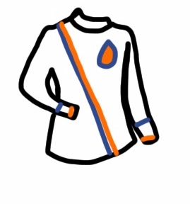
Jared also sent in this concept for the Oilers. I like the sash-style striping, it's a unique look which has a bit of history in Edmonton. I also think this layout of the jersey is the best we've seen from Jared, as it seems to hide some of his execution errors. There are still some errors though, including the sash-stripe which has a gap between the orange and blue at the bottom but no gap on the upper half. Also the finer details get lost (which has been a problem with Jared's concepts), most noticeably on the oil-drop which is much more rounded on top than it should be. In my opinion the only way too fix that problem is to take your time and not rush your concepts.
Enjoy the rest of your day!


No comments:
Post a Comment
Note: Only a member of this blog may post a comment.