Oakland Athletics, by Ricky:
Today we have a couple of guest concepts, both by Ricky and both of them are hockey concepts for teams from other sports. Here he creates four jerseys for the Oakland Athletics. Starting with the positives, I like the yokes on the primary jerseys, the sleeves on the yellow jersey, the arched player names, and the two colour helmet. The logos on the first three jerseys also look good, and the Athletics colour scheme is one of the best colour schemes ever. Moving on to the negatives, there are many elements carried over from baseball that I don't think work for hockey. Those elements include the light pants, the socks that don't match the jersey colour, the piping on the yellow jersey, and the many pairs of similar gloves. I also think there is a need for more striping on the primary jerseys, the black jersey, and all the socks.
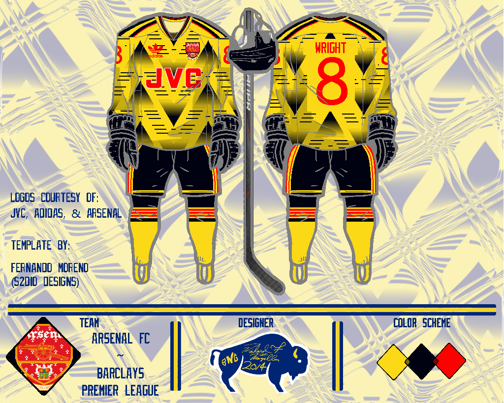
Arsenal FC, by Ricky:
For his second concept, Ricky gives Arsenal FC a hockey jersey with a unique pattern. In my opinion that pattern is too busy and garish (and this colour scheme doesn't help that fact), it's kind of like the Canucks' "Flying V" taking to the extreme. The number font isn't my favourite either, it has a kind of childish feel to it. I do think the striping on the pants, socks, and shoulder yoke could be the start of something good. One last thing, I think this template looks better when the lines are black, like how they were for the Oakland concept.
Before you go, I thought I'd clarify what concepts I accept on this blog. Basically I'll accept any concept for a hockey team (so soccer jersey concepts for hockey teams are okay, etc), or any concept done on a hockey template (like the above concepts). As long as it's related to hockey somehow, and not offensive or anything, then I'll accept it.
Thanks for visiting!


No comments:
Post a Comment
Note: Only a member of this blog may post a comment.