Today is the second anniversary of this blog, as the first post was on April 15th, 2012. Since then there has been 178 more posts, including 30 posts with concepts by a guest (today is one of those posts).
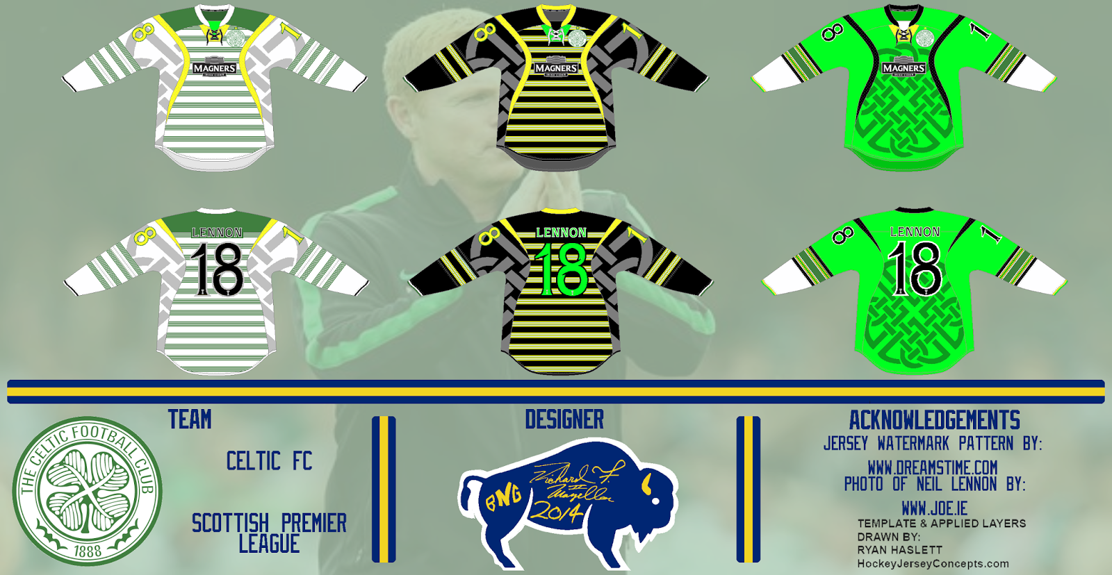
Celtic FC, by Ricky:
Today is also the first time there has been a concept for a soccer team on this blog. I'm probably not the best person to review this concept since I don't follow soccer at all, but I'll give it my best shot. Looking at the jerseys my first impression is that they're too busy. For the first two jerseys I'd recommend getting rid of the pattern in the armpit/shoulder area, or at least make it much more subtle. I also think the horizontal stripes would look better if they were thicker and simpler. I like the green jersey better, but I think the shade of green is too bright, just darkening it a little bit would improve it a lot. I also think the sleeve stripes on that jersey should be simplified more. On a more positive note the execution is very good, and I like some of the minor details like the trophies in the numbers. Overall these jerseys are just too busy for me, I tend to like simpler designs, but that doesn't mean these are bad, just that I don't like them.
Grade: C-
Calgary Flames Third:
I wanted to make a third jersey for the Flames that uses the shoulder logo from their current third jersey as the main logo. I decided to use angled stripes like their 2000-07 jerseys, but I used those angled stripes as a chest stripe instead of hem stripes. The rest of the concept is pretty self-explanatory.
Have a good day!


No comments:
Post a Comment
Note: Only a member of this blog may post a comment.