December 31, 2013

Dodger Stadium Guest Concept

Ducks and Kings Stadium Series, by Ricky:
Tomorrow is the Winter Classic, but today we have a concept for the outdoor game coming up in Dodger Stadium.  Overall I really like the differences to the actual Stadium Series jerseys, gone are the wacky numbers and chrome logos, but there is a cool new feature which is the design on the helmets.  Although I don't like the fact that both of these jerseys use the same striping pattern.  I also think both jerseys would benefit by using the mesh colour somewhere in the striping, and the Kings numbers should be either white or silver as the numbers don't contrast enough how they are now.

Stay tuned, as there will be more Stadium Series concepts by Ricky in the coming days, and I have to say that these Stadium Series concepts (today's and the upcoming ones) are probably of my favourite concepts by Ricky to appear on this blog.

So that's all for 2013 folks.  Come back next year (tomorrow) to see an updated look for the blog.

December 28, 2013

Millionaires Jersey and Canucks Guest Concept

Hello folks.  I hope you all enjoyed your holidays, I know I did.  I got to see some relatives I rarely see, had some good food, and got some nice gifts including this Vancouver Millionaires jersey.
This jersey had been on my wish-list since the Canucks unveiled it, so I was thrilled to get it for Christmas.  I've added it jersey to the My Jersey Collection page, which you can get to by clicking the image on the right side of the page that says "My Jersey Collection" or by clicking right here.  Now let's move on to a concept.

Vancouver Canucks, by Justin S:
This is Justin's take on a Canucks De-Edge set.  It's not a bad look, but I don't think it's an improvement over their current set, and it's not that original either.  These jerseys are just blue and green versions of the Senators 1995-99 jerseys, but with contrasting shoulder yokes.  I suggest changing the striping pattern to something new, and also adding a logo to the shoulders, the Canucks have lots of good secondary logos.

Have a good day!

December 23, 2013

Indy Fuel Guest Concept

Well, I was hoping to have this post up several days ago but I have had a busy/rough week.  First of all I was busy with some Christmas shopping and decorating.  I also had a stomach pain on and off for a few days.  That stomach pain eventually got a lot worse, which then ended up with me having surgery to have my appendix removed.  Now I'm at home recovering, which finally gave me time to complete this post.

Indy Fuel, by Caden (Hockey Concept Ideas):
We start of with a concept for the newest ECHL franchise, the Indy Fuel.  I like the checker-pattern for the stripes, it makes a lot of sense for a team named Fuel.  Although I think the jersey needs something else to go with those stripes, maybe a yoke or coloured cuffs.  A few other suggestions, I think the name and numbers on the white jersey should have a black outline, the front number on the red jersey should match the other numbers, the sleeve numbers should be the same font as the back numbers, and the collars shouldn't be yellow.

Montreal Canadiens, by Justin S:
Just when you thought you were done seeing De-Edge concepts on this blog, there's more, not by me though by Justin.  I really like the white jersey, it's a great throwback to the Canadiens 1935-38 white jersey.  I'm not as much of a fan of the red jersey, it doesn't necessarily look bad but it looks a bit generic compared to the Canadiens classic jerseys.  A couple of execution notes, the registered trade-mark symbol should be removed from the white jersey's logo, and I also suggest saving your concepts as png's rather than jpg's (png's don't have any pixelization issues when saving).

Merry Christmas!!!

December 15, 2013

Jets and Oilers Guest Concepts

As I mentioned yesterday, I've applied a special holiday design to the blog.  I brought back the candy-cane stripes behind the page links from last year, but I have a completely different snow flake design this year.  Since I'm sure no one will remember last year's design I've included the image below.
Last year's holiday design.

Winnipeg Jets, by Ricky:
Here's a red third jersey for the Jets, which includes some Atlanta Thrashers elements.  I've never thought red was a good jersey colour for the Jets (they have always been a blue team), but I'll ignore that for this concept.  There are some things I like on this concept, like the light blue shoulder yoke which contrasts well against the red jersey.  There are also some things that I don't think work well, like the dark red cuffs and side panels.  The dark red doesn't stand out enough from the light red used for most of the jersey, so the dark red elements just get lost.  I also don't think the Thrashers numbers fit with the Jets identity, and the white panels from the Thrashers old road jersey look a bit forced.

Edmonton Oilers, by Caden (Hockey Concept Ideas):
For this Oilers third jersey concept, Caden made a bold decision by going without any white at all.  It's a risky move, but I think it pays off here.  The logo looks really good, I've never seen the script put inside of the oil-drop before, but it works well.  I  also like the font used, it fits the modern look of the jersey.  What I don't like is how plain the jersey is.  The piping would disappear at a distance, and then the jersey would just look like a practice jersey.  Also, execution wise, there are some loose white pixels near the collar, near the sleeve stripes, and near where the piping meets the shoulder yoke.  Cleaning up those loose pixels is really easy, and it saves your concept from looking rushed.

Thanks for visiting!

December 14, 2013

Atlantic Division De-Edge Vintage Jerseys

Here are the vintage jerseys for the final eight team's in my De-Edge series.

Boston Bruins Vintage Set:
The Bruins won two Stanley Cups (including Bobby Orr's famous flying in the air goal), while wearing these jerseys.

Buffalo Sabres Vintage Set:
These are the Sabres original jerseys.

Detroit Red Wings Vintage Set:
The Red Wings wore this set from 1948-61, and during that time they won four Cups (1950, 1952, 1954, 1955).

Florida Panthers Vintage Set:
These are the original uniforms for the Panthers.  They also went to the Stanley Cup final wearing these in 1996.

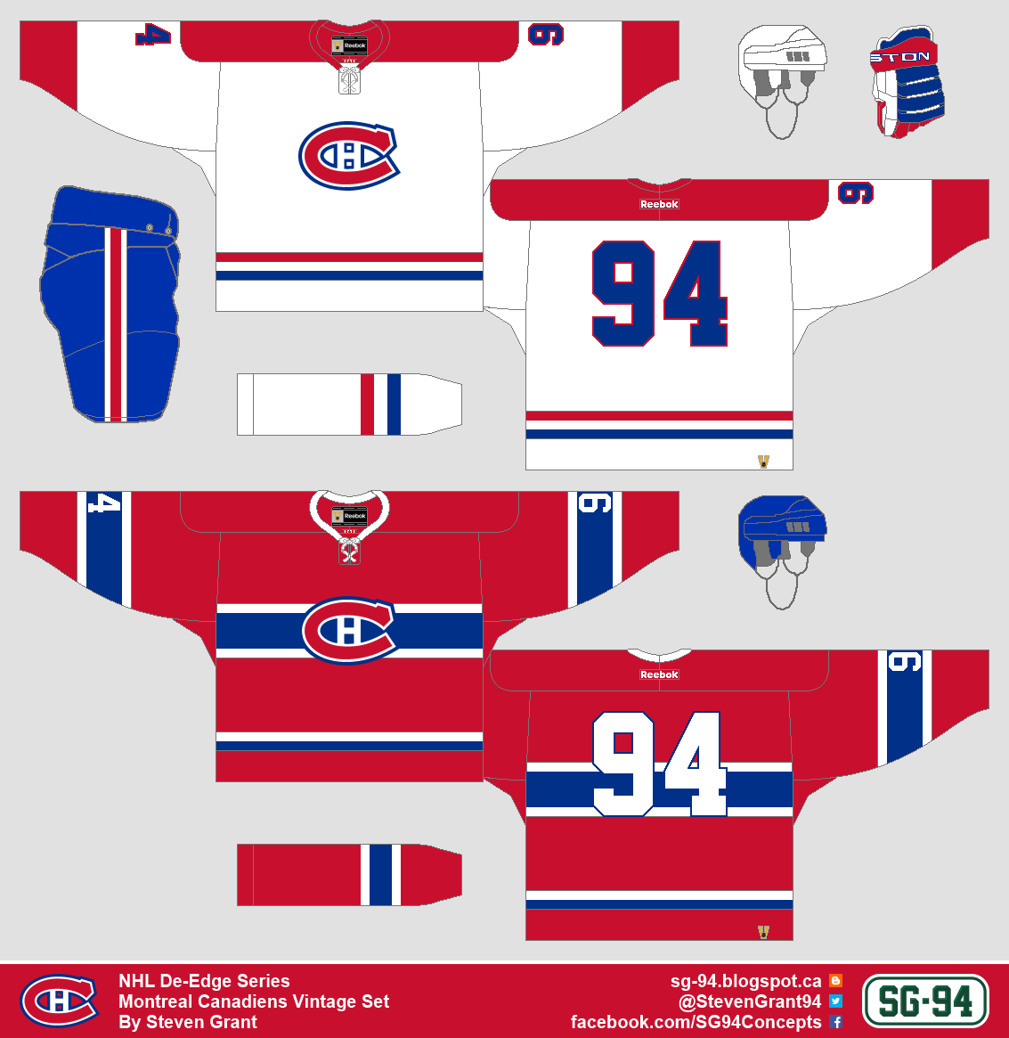
Montreal Canadiens Vintage Set:
This set is from 1966-70.  During that time the Canadiens won three Cups (1966, 1968, 1969).

Ottawa Senators Vintage Set:
Ottawa wore this set from 1997-99.

Tampa Bay Lightning Vintage Set:
The Lightning won the Stanley Cup in 2004 wearing these jerseys.

Toronto Maple Leafs Vintage Set:
This set dates back to 1962-63, a year when the Leafs won the Cup.

My De-Edge series is now finished.  All the jerseys can be found on the NHL De-Edge series page, which you can get to by clicking the image on the right side of the page, or by clicking this link right here.

So what's next for this blog?  There will still be concepts by me, they just won't be part of a series.  I will also still be posting any concepts that are sent in to me, and I will probably being doing more jersey review posts (like the Stadium Series jerseys, Olympic jerseys, etc).  Also starting tomorrow I will have a Christmas design applied to the blog, and then in the new year I might update the blog's design a bit.

Have a good day!

December 13, 2013

Wild Guest Concept

Minnesota Wild, by Ricky:
This concept confuses me a bit, because when I first glanced at it I really liked it, but then when I looked closer and thought about it more I didn't like it very much any more.  I liked it at first because it has good colour balance, the yellow base works well with the red arms and green stripes near the cuffs and green numbers.  But when I looked closer I saw lots of piping which I don't like, and I also saw the name on the back is too small.  Then when I thought about it I realized yellow doesn't make much sense as a jersey colour for the Wild being such a minor colour in their brand, and I also realized the such a retro-looking logo doesn't work well with a more modern jersey.  So to sum up, this concept had a good first impression, but wasn't that good after that.

Thanks for visiting!

December 12, 2013

Metropolitan Division De-Edge Vintage Jerseys

The Metropolitan Division part of the vintage jersey program for my De-Edge is here!

Carolina Hurricanes Vintage Set:
The Hurricanes won the Stanley Cup in these jerseys in 2006.

Columbus Blue Jackets Vintage Set:
This is the Blue Jackets original jersey set.

New Jersey Devils Vintage Set:
I also went with the Devils original jersey set, which they wore from 1982-92.

New York Islanders Vintage Set:
The Islanders won four cups in a row (from 1980-83) wearing these jerseys.

New York Rangers Vintage Set:
The Rangers wore this set from 1951-63.

Philadelphia Flyers Vintage Set:
Two Cups were won by the Flyers (1974, 1975) while wearing this set.

Pittsburgh Penguins Vintage Set:
The Penguins also won two Stanley Cups (1991, 1992) wearing this set.

Washington Capitals Vintage Set:
These are the basically the jerseys the Capitals entered the league wearing, but this exact set was worn from 1987-90.

Do you like my choices of jerseys?  Do you hate my choices of jerseys?  Feel free to let me know.

Have a good day!

December 11, 2013

Coyotes Guest Concept

Phoenix Coyotes, by Ricky:
Ricky sent in this concept for the Coyotes.  If I understand correctly, he was trying to make a jersey as crazy as the Coyotes 1998-2003 third jersey, but the end result is not good.  I'm sorry but I can't find a single thing I like about this concept.  The colours used look bad together, the hem stripe is too detailed and doesn't look good cutting across the side panels, and the logo doesn't work as a primary logo in my opinion.  My suggestion would be to just scrap this concept and start over.

That's all for today, come back tomorrow for more of the vintage jersey program part of my De-Edge series, and then later in the week there will be more concepts by Ricky.

December 10, 2013

Central Division De-Edge Vintage Jerseys

I'm back with part two of the vintage jersey program for my De-Edge series, this time for the Central Division.  Also, as you can see, the vintage header at the top of the page is now onto my shield logo.

Chicago Blackhawks Vintage Set:
The Blackhawks wore these jerseys won they won the Stanley Cup in 1961.

Colorado Avalanche Vintage Set:
These are the classic Avalanche jerseys, but specifically from 1999-2007 (darker shade of burgundy).  They won the Cup in 2001 wearing this set.

Dallas Stars Vintage Set:
The Stars wore these jerseys 1995-99.  The Stars won the Stanley Cup in 1999 when these were their home and road jerseys (although they did wear their third when they won the Cup).

Minnesota Wild Vintage Set:
These are the Wild's original jerseys.

Nashville Predators Vintage Set:
I also went with the Predator's original jerseys.

St. Louis Blues Vintage Set:
The Blues wore these jerseys from 1968-73.  The went to the Stanley Cup final three times during that time.

Winnipeg Jets Vintage Set:
This may surprise some people, but I went with the Jets current jerseys.  I wasn't going to throwback to the original Jets since they are a different franchise, so my only other option was Atlanta Thrashers jerseys.

Once again you can let me know if you think my choices are good or bad.  Thanks for visiting!

December 08, 2013

Pacific Division De-Edge Vintage Jerseys

It's vintage week on SG-94!  Each day this week I'll be bringing back a header (design at top of blog) that I've previously used, and today's is the first header used on this blog.  There were seven different headers I used before I switched to this blog template, so come back each day to see all seven old designs.  The headers are un-altered, besides being extended sideways to fit the current blog template.

Also I'm bringing back the NHL's vintage jersey program for my De-Edge series, but this time it will include all 30 teams, and I've made a few rules for myself.  Fist of all I can't alter anything, the jerseys have to be true throwbacks (not fauxbacks like the recent Winter Classics).  Also both the home and road jerseys must be from the same year.  Speaking of home and road jerseys, I made the home jerseys the light colour and road jerseys dark.  And this isn't really a rule, but I tried to throwback to jerseys teams had success in.

Anaheim Ducks Vintage Set:
These are the jerseys the Ducks wore during their trip to the Stanley Cup final in 2003.

Calgary Flames Vintage Set:
The Flames wore these jerseys when they won the Stanley Cup in 1989.

Edmonton Oilers Vintage Set:
This is the classic Gretzky-era Oilers set.

Los Angeles Kings Vintage Set:
This is the Kings original jersey design, but specifically this set was from 1979-80 (no gold pants but with player names).  The Kings now have five jerseys in my De-Edge series, and none of them are white.

Phoenix Coyotes Vintage Set:
These are the Coyotes original jerseys.

San Jose Sharks Vintage Set:
I also went with the Sharks original jerseys.

Vancouver Canucks Vintage Set:
For the Canucks I went back to the jerseys they wore when they went to the Stanley Cup final in 1994.

Feel free to let me know want you think of my choices for each team.  Have a good day!

December 04, 2013

Guest Concepts: Islanders, Sharks, and Flames

I'm not ready to post the next part of my De-Edge series yet (hopefully it will be ready by this weekend), but we do have three guest concepts by Ricky.

New York Islanders, by Ricky:
We'll start off with this Islanders concept, which is Ricky's entry into HJC's Make The Fishsticks Logo Look Good Competition.  There are two things that I really like about this concept, and there are two things that I don't like.  First of all, the fact that the primary colour is orange is great.  I also love the shoulder yoke design, it's a unique feature that looks good, something that is not easy to do.  I don't like the use of the Ottawa/Pittsburgh/Old-Tampa-Bay template, it doesn't necessarily look that bad, but it is a very overused template in the NHL.  I also don't like the gold added to the logo, I understand why it was done (the stereotypical raincoat is yellow), but I personally don't think it looks good.

San Jose Sharks, by Ricky:
Ricky's second concept is also an orange jersey, but this time it's for the Sharks.  The striping is pretty good, I like the unique side panels.  The one issue I have with the striping is that the sleeve-length-stripes are cut off by a shoulder-yoke, which I don't think looks good.  I also think the TV numbers are too big, and the player name isn't very readable the way it is now.

Calgary Flames, by Ricky:
For his final concept today, Ricky designs a black jersey for the Flames.  The colour balance is really good, with yellow being used more in the stripes, and red being used for the yokes and numbers.  That being said, I think the red names and numbers would be hard to read.  My suggestion would be to make the names and numbers yellow, but then make the stripes mostly red to keep the good colour balance.  I do like the logo choices, but I don't like bringing back the flaming C captain's patch.

Thanks for visiting.