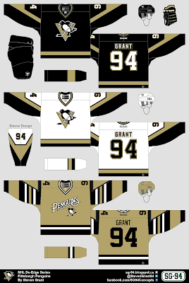
You may have noticed there has been a longer wait between these last few posts. That's just because I'm running out of ideas for new concepts. Inspiration seems to come in waves though, so hopefully this lull in ideas won't last to long. Also I do plan on doing a third jersey for the Coyotes, but I haven't been able to come up with anything good, so I've skipped them for now.
I made a gold third jersey for the Penguins (which would be used against dark jerseys to fit in with the rest of this series), with a script/logo combo similar to the Flames new third jersey. That logo below the script is the penguin from their primary logo, but without a triangle behind it. I ditched the triangle from the logo because (like with the primary jerseys) this jersey has triangles on each sleeve. The striping pattern is kind of inspired by the jerseys the Penguins wore from 1977-92. Also the number font is the same as what Pittsburgh currently uses, but without any outlines.
Sleeve Design:
This is a side-view of the sleeve design.
Full Set:
And here is a look at the full-set.
Thanks for visiting.
-------------------------------------------------------------------------------
Update 1 (Nov. 9):
Here is a version with the sleeve numbers in the triangle, based off of Justin's comment.
Here is a version with the sleeve numbers in the triangle, based off of Justin's comment.
When I first read Justin's comment I thought it was a great idea, but now actually seeing it I think the numbers look a bit too squished-in and off-centered, so for now I'm keeping the first version as the official version.
Let me know if you think I'm wrong.
-------------------------------------------------------------------------------
Update 2 (Nov. 21):
Yesterday on HJC Dylan Wonka suggested I add white to the numbers, and looking at it again now I agree with him, the numbers need white.
He also suggested that I move the TV numbers to the triangle like Justin suggested earlier. I still wasn't convinced, but it was two against one, so I thought I'd test it out again but this time using the overhead view (because that would be the best view of the TV numbers). Once I saw how it looked using that view, my mind was changed, it didn't look awkward like I was picturing looking at my normal template. So this version is now the official version.
Here is that overhead view.
Thank you to both Justin and Dylan for the advice, and I also want to apologize to Justin for being a bit stubborn at first.


.png)


.png)
Wow. I absolutely love this. The only recommendation I would make is to put the sleeve numbers in the triangles. Other than that, this is beautiful. Great work as usual, Steven.
ReplyDeleteThanks for the comment Justin, I appreciate the feedback. I tested out your suggestion (as you can see above), but I think it is a bit too much of a tight fit with the double-digit numbers. Although it did look good when I tested it with single digit numbers.
Delete