Buffalo Sabres, by Ricky:
We start off with a Sabres concept by Ricky. All three jerseys are a very unique mix, and I love when people try something different, but I don't think it works well here. My biggest problem with this concept is that it mixes very retro elements like the logo and hem-stripes from the Sabres 40th anniversary jersey, with very modern elements like the sleeve design from the Sabres current third jersey and the number font from their1996-2006 jerseys. The third jersey also has a mix of retro and modern that I don't think works. My suggestion would be to choose either modern or retro, and then make all the jersey elements match the look you choose.
Buffalo Sabres, by Jake88:
We also have a Sabres concept (as well as a Hurricanes and a Sharks concept) from Jake, who has a blog called Jake88 Jersey Concepts. I love the striping pattern used here, it's unique without being to crazy. The logo and fonts go great with the look created by the striping pattern. My one suggestion would be to switch the grey and yellow on the pants, because I like seeing more yellow than grey for the Sabres, but that's a very minor complaint.
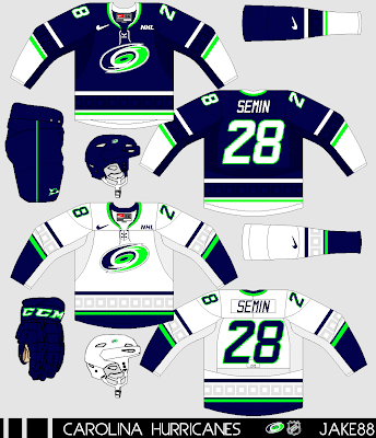
Carolina Hurricanes, by Jake88:
For Jake's Hurricanes concept, he went back to blue and green like from the franchise's Whalers days, but with what he calls a "Nike twist" by using neon green. I can't say I'm a fan of this colour scheme for the Hurricanes, I've never associated neon green with hurricanes. Looking past the colours, I like the rest of the concept, the sublimated hurricane-flag pattern looks really good here.
San Jose Sharks, by Jake88:
Jake's final concept today is this set for the Sharks, which feature's a wave pattern on the sleeves. I really like that wave pattern, it's subtle enough but still is unique and works well for the Sharks. Although I think it might be better if it wasn't angled. The rest of the concept is good, I have no complaints.
-------------------------------------------------------------------------------
San Jose Sharks Third:
I went with a black third jersey for the Sharks. The striping pattern is partly inspired by jerseys San Jose has worn in the past, and partly inspired by the home and road jerseys from this series. There is a new helmet, but the rest of the equipment is carried over from the home and road jerseys.
Full Set:
Here is a look at the full set.
Thanks for visiting.


I appreciate the s/o!
ReplyDelete