October 27, 2012

Surrey Eagles

You probably read that title there and said to yourself "Who?".  The Surrey Eagles are a team in the BCHL (a Junior A league here in British Columbia).  Here is a link to their photo gallery section of there website, so you can see what their current jersey look like.  I've decide to do some concepts for the BCHL because I'm out of Ideas for NHL teams.

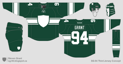
Surrey Eagles:  I used the jersey worn by the eagle in their logo as inspiration for this concept.  I then used a green jersey as the coloured jersey because I like the colour green.

Also sorry for the long time between posts.  I had no ideas for new concepts, and I've been busier than normal lately.  Hopefully I'll have more posts now that I'm doing some BCHL concepts.

October 17, 2012

Wild Contest Entry

Minnesota Wild:
This is my entry for HJC's Minnesota Wild Redesign competition.  The striping is a more traditional take on the Wild's original jerseys.  The logos are the same as what were used for their first ten years of existence.

October 15, 2012

One Team, Four Cups

New York Islanders:
We all know the Islanders love using symbolism for their four cup wins, with the four stripes in their current logo and their previous alternate logo.  So I created this third jersey with four stripes to continue that history of symbolism.

October 11, 2012

Quick Update

Just a quick update to point out the list of other blogs I've added to the sidebar (right).  It lists the blogs in order of most recently updated, and it's basically all the hockey blogs I have as Bookmarks right now.  I have to give credit to Tyler Gross of Hockey Uniform Concepts, as that's where I first saw this done.

October 10, 2012

Predators and Pink

Jersey News


(Image from www.sagueneens.com)
The Chicoutimi Saguenéens of the QMJHL wore special uniforms last night to raise awareness for breast cancer research.  They look like most other breast cancer awareness jersey, lots of pink added, and using features from their regular jerseys.

(Image from www.saskatoonblades.com)
Also, the Saskatoon Blades of the WHL will be wearing special event uniforms for their October 20th game against the Everett Silvertips.  The jersey features a new roundel logo for the event, and has an awesome feature in the bottom stripe.  The bottom stripe will include a list of names of Blades season ticket holders' family members and friends who have lost their battle with cancer.


Concepts

Nashville Predators:
I like the Predators current colour scheme, but I also really liked the striping on their original uniforms.  So for this concept I tried to combine the two, while also changing a few things.  The current logos and numbers are used, but the NOB is slightly different.  The stripes are the same for all three jerseys, just the main part changes colour.

SG-94 Concept:
I've been using a blank shield as a logo more often recently (Twitter logo, favicon, and on my template) so I had to see what it would look like on a concept.  Then after I made the concept I had to post it here.  I tried to make it look vintage with a chest stripe, shoulder numbers, and a box around the back numbers (similar to a name bar).

October 05, 2012

Johnny Canuck

Vancouver Canucks: 
 
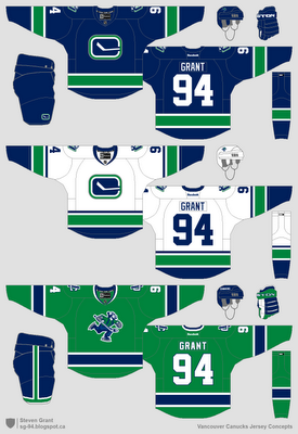
The home and road are updates to their original (and current) uniforms, with the updated "Stick-in-the-Rink" logo on the front.  Johnny Canuck is used on the shoulders and helmets.  The third jersey is green (almost just a re-colour of the home), with skating Johnny as the main logo, and the interlocking VC logo as a shoulder patch.

Hopefully I'll make a few more concepts sometime soon.