June 30, 2012

Jersey Collection

I added a new tab for my jersey collection.  Go check it out.


Also, sorry for the lack of concepts lately.  I will try to post something soon.

June 23, 2012

Grey Hurricanes

Carolina Hurricanes:  I wanted to try a grey jersey, and I thought the Hurricanes were a good team to test it out.  It also features a chest stripe.

Thoughts?

June 18, 2012

Crazy Canucks Concept

Vancouver Canucks:  I've seen a few soccer inspired jersey concepts recently and I got an idea for this Vancouver Canucks concept.  The angled stripes are supposed to be subtle V's.  I also added sublimated stripes similar to my Ottawa Senators concept.

Is it too crazy?  Leave your thoughts in the comments.


Edit:  Tyler J. Gross suggested that I end the sublimated stripes at the blue/white stripes.  I couldn't get that to work, but here is a version without any sublimated stripes.

June 15, 2012

Quebec Nordiques

My dog is amazing, he went a perfect 7 for 7 predicting series winners (he didn't make any picks for round one).  If you are wondering how he picked teams, I'll now tell you.  We wrote the team name on a piece of paper, and then put a dog treat on both pieces of paper (one for each team in the series).  We then put the dog on one side of the room, and the two pieces of paper on the other side.  Whichever treat he ate first was the team he picked.

That's enough about my dog though, time for concepts.  This whole post is about what the Quebec Nordiques would look like if they never moved.  I made a fake timeline of what their jerseys might look like.  If you want to see what their jerseys looked like before they moved check out both whauniforms.com and The Hockey Uniform Database.

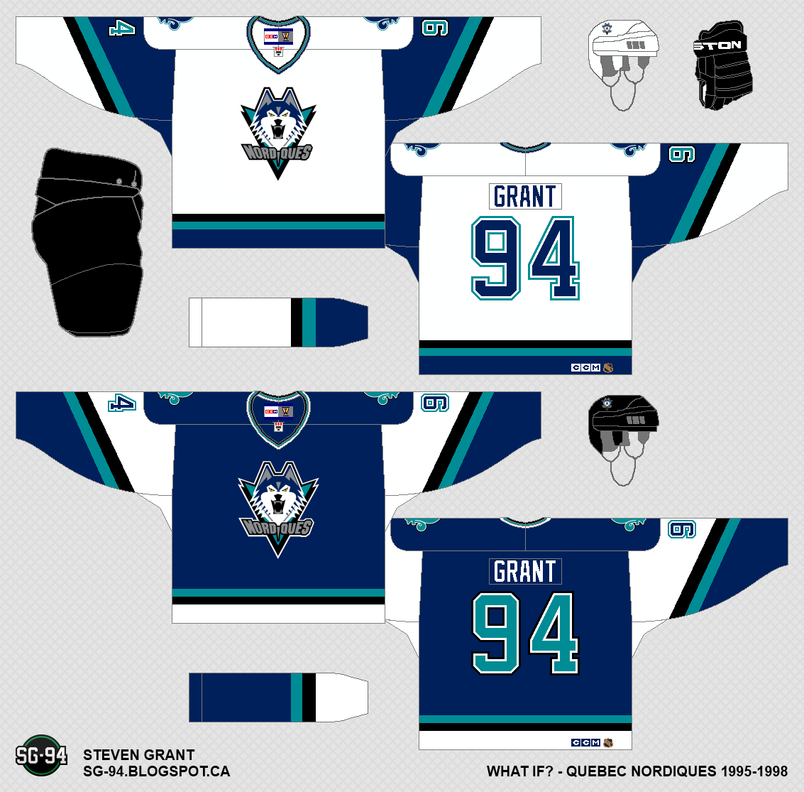
1995-1998:  In 1995 the Nordiques completely redesigned their uniforms.  The colours changed, and a wolf became the primary logo.  These jerseys weren't liked by most fans, and as a result they only lasted three years.

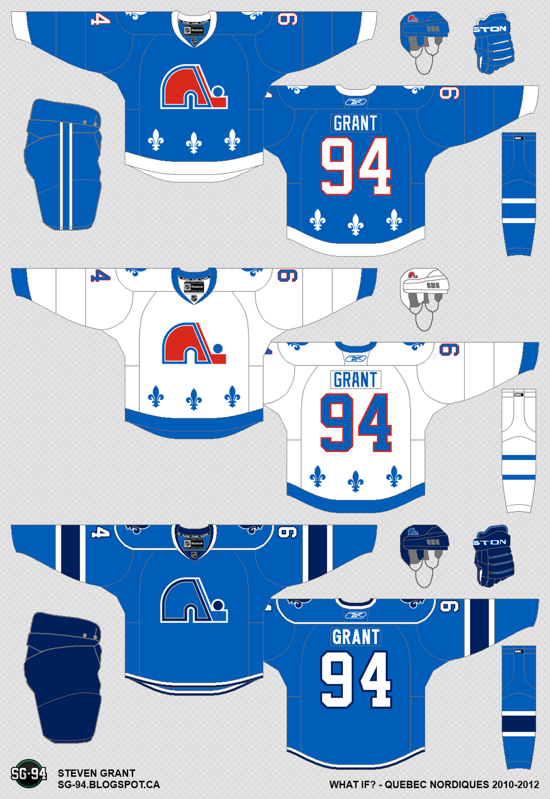
1998-2003:  In the summer of 1998, the Nordiques announced that the unpopular "Wolf" jerseys were going away.  Many fans were hoping for a return to the classic logo and jerseys.  They did get their logo back, but the jerseys were new, with navy and silver added to the colour scheme.  Many fans liked these jerseys, but some were disappointed that the classic jerseys weren't back.

2003-2007:  The Nordiques added a third jersey in 2003, which would last until the Reebok Edge jerseys in 2007.  The jersey was navy blue with lots of silver.

2007-2008:  Slight changes are made to the jerseys during the switch to the Reebok Edge template.  A phantom shoulder yoke was added, and the hem-stripes became smaller.  These changes weren't well liked by fans, who still wanted to see a return to the classic set.

2008-2010:  When the third jersey program was re-introduced in 2008, the Nordiques finally listened to their fans by adding a throwback jersey based on their 1991-1995 blue jersey.

2010-2012:  The third jersey became the home jersey, and a matching away jersey was added.  The previous home jersey stayed as a third jersey.

2012-Future:  On June, 15th 2012, the Nordiques announced they are scrapping the third jersey and will only have two jerseys for the next season.

Thanks for visiting.  I'm considering doing the same thing for the Winnipeg Jets, but I might not.

June 09, 2012

Marooned

If the Kings win the cup today, my dog will have gone 7-0 in playoff series predictions.  He didn't make any picks for the first round, but has gone perfect since then.  Anyways, here are two concepts.

Montreal Maroons:  I was making a concept for my local minor hockey association when I realized that, with a few changes, it would work well for the Montreal Maroons.

Dallas Stars, by Alan:  Here is a great Stars concept by Alan.  He changed the font of the logo,  number, and nob to Kroftsmann, and also added a 3D effect to the logo with a second shade of gold.  The only thing I don't like about this is the white space between the letters in the logo.

I still have a post about the Quebec Nordiques in the works, but I don't know when I'll get around to posting it.

June 04, 2012

Retro Bruins Concept

Now that the NHL Redesign is done, I won't be able to post as often.  Expect only 1-2 posts a week.

Boston Bruins:  I made this retro bruins concept by combining different features of their past jerseys.  It probably wouldn't work due to it's lack of names on the back, but I thought I'd post it anyway.

Ikea Concept, by Ricky:  I have never seen an Ikea concept before this one.  I wonder who they would play against?  I'm not a big fan of the actual concept, the boxes around the name, number, and logo seem to ruin the flow of the jersey.  Also the outside stripes would be horizontal most of the time, due to the arms being bent, but the inner three stripes would be vertical.  I think it would be better if they were all vertical.  If you fixed those issues, I think you would have a good jersey.

Thanks for visiting.