May 29, 2012

Bonus NHL Redesign Concepts

I have posted a home, road, and third jersey far all 30 teams.  Here are a few more concepts.

New Jersey Devils (St. Patricks Day):  For the last few years the Devils wore a rerto red jersey.  To change it up a bit, and also because I like the white version of that jersey better, I would have them wearing their retro white jersey.

Toronto Maple Leafs (St. Patricks Day):  As I said in my "We Need More Green!!!" post, I think Toronto should wear St. Pats throwback jerseys on St. Patricks day.  Here is a 1919-22 throwback jersey.

All Star Game:  I liked the red and blue jerseys that have been used the last few years, but I also think it is time for a new design.  I kept the current colour scheme, and used striping inspired by 1947-59 Jerseys.

Winter Classic:  I liked Winter Classic jerseys best when they were true throwbacks, so that's what I did.  Detroit's Jersey is from 1932-37, and Toronto's is from 1934-37.

Stanley Cup Finals:  Also, here is what this years final would look like with jerseys from my NHL Redesign.

May 28, 2012

NHL Redesign Updates

Here are some updates suggested by the folks at CCSLC.

Dallas Stars:  I changed the inside of the star to white on the green jersey.  Here is the original concept.

Nashville Predators:  I changed the collar on the home and roads to what they have now.  Original concept.


New York Islanders:  I brightened the orange and changed up the striping on the road jersey.  Original concept.


New York Rangers:  I thickened the white space between the stripes on the road jersey.  Original concept.

Phoenix Coyotes:  I switched the shoulder patches.  The logo that was on the third is now on the primary jerseys, and vice-versa.  Original concept.

Tampa Bay Lightning:  I added a blue outline to the numbers on the home and road.  Original concept.

Vancouver Canucks:  I switched the third jersey to the jersey that was on my "We Need More GREEN!!! " post.  Original concept.

So now all the teams are final.  I will post some bonus jerseys in the next day or two.

May 25, 2012

Final Three Teams

Here are the last three teams in the NHL Redesign.  There is one more NHL Redesign post left with a few bonus concepts.

Vancouver Canucks:  The Canucks are my favourite team, and these home and road concepts are my ideal jerseys for them.  They're an update of their 1972-78 jerseys, with a updated logo too (the logo is basically halfway between their old and new stick-in-the-rink logos).  The third jersey is green, with johnny as the logo, and a V-pattern on the sleeves.

Washington Capitals:  I changed up their home and road a bit, getting rid of the side-panels.  I then included a throwback red third jersey.  I was considering a blue jersey with the weagle logo, but I couldn't get it to look right.

Winnipeg Jets:  I went with a military theme for the home and road, with the chevrons on the sleeve and the stencil name and numbers.  The home jersey is also the lighter blue, because I thought it provided better contrast with the logo.  The third jersey is inspired by the WHA Jets 1975-77 blue jersey.

So that's all 30 teams completed.  Anyone have a favourite concept?  Anyone think I messed up a team?  Let me know.

May 21, 2012

Blues, Bolts, and Leafs

As promised, here is the next NHL Redesign post.

St. Louis Blues:  The home and road are a inspired by their early jerseys, but with their current colours.  The third jersey is the lighter blue, and it features sublimated music-staff striping.


Tampa Bay Lightning:  The primary jerseys are updated versions of their original jerseys.  I used their original "Hawaiian blue", and their current logos.  The third is completely black and white (which would be the first black and white jersey in the NHL since 1934).

Toronto Maple Leafs:  The home and road have no changes.  The third jersey is a faux-back jersey, which features the old "T" logo inside of their vintage leaf.

I don't know if anyone here is also following this series on CCSLC, but there have been some updates based on their comments.  I will post all the updates here after this series is complete.  The final three teams are next.

May 17, 2012

Green and White Stars

Just a quick post today for this Stars concept.

Dallas Stars:  I wanted to try a Dallas Stars concept that only used green and white.  I edited the logo to have a bigger gap between the inside and the outside of the star, and then made the striping pattern match. 

Expect the next NHL Redesign post sometime around Monday.

May 13, 2012

Some Animals (Coyotes, Penguins, and Sharks)

This post has lots of animals.  Speaking of animals, my dog literally predicted all the series in round 2 correct.  Isn't that amazing?  (He predicted the Kings and Devils to advance to the final).

Phoenix Coyotes:  This is a mix of my favourite elements from their two eras.  The third jersey features the dessert scene from their 1998-2003 third jersey, but now it's sublimated. 

Pittsburgh Penguins:  I'm actually a fan of their vegas gold, so I kept it.  I did borrow elements from the Lemieux era with the coloured arm-tops, but I used different striping.  I also kept their recent tradition of blue third jerseys, with a 1977-80 throwback jersey.

San Jose Sharks:  I changed up the striping on the home and road, and also made orange a bit more prominent.  The third jersey has more traditional striping and is black.

Only two more NHL Redesign posts left.  Afterwards I have a post about the Quebec Nordiques, but I don't know what I'll do after that.

May 12, 2012

My Concept History

A special post today about the history of my concepts.  The execution is pretty bad on some of these, but please don't laugh.

I first starting making concepts near the end of 2009, when my local minor hockey association got new jerseys.  These "concepts" were basically me recolouring jersey from The Hockey Uniform Database, like this Team USA concept from January 2010.

A few months later I found the website Icethetics, and I took someone's concept to make a better template.  Here is a St. Louis Blues concept I made in May 2010, using that template.

Later that year I found a cleaner template, and decided to attempt an NHL series.  That series was very incomplete, I only made concepts for about half the teams, and many of the concepts were incomplete.  This Canucks concept from July 2010, and this Ducks concept from November 2010, are from that NHL series.


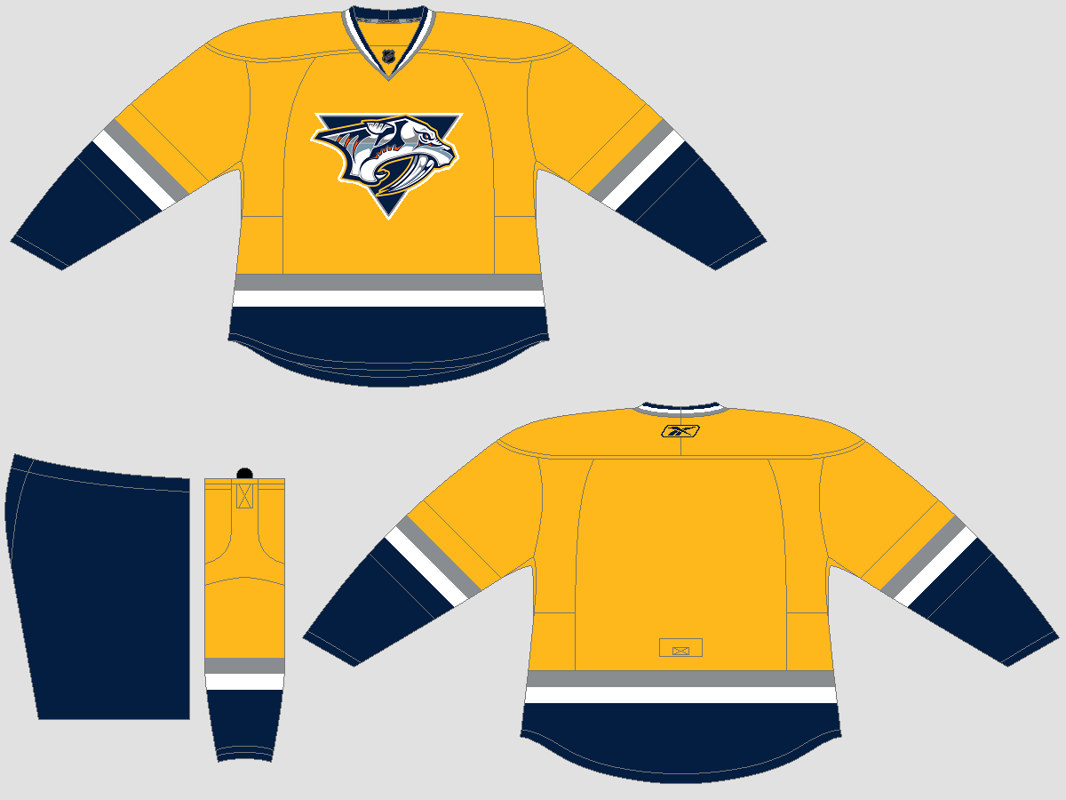
By the beginning of 2011 I had started using a brand new template.  This new template was a lot harder to use, but I thought it looked better.  I also didn't put numbers on my jerseys, because the numbers for the other template were to small.  This Predators jersey from February 2011, was my prediction of what their new jerseys for 2011-12 would look like.

I was still using the older template as well, and in March, when it looked like the Coyotes might move to Winnipeg, I sent Icethetics this concept.  This was my first concept posted on the Internet.
Image from Icethetics

Then two months later, when we knew the Thrashers were moving to Winnipeg, I sent in this concept to Hockey Jersey Concepts.  This was my first concept on HJC.

By summer 2011 I almost quit making concepts.  It just took too much time to create a concept on the template I was using.  Finally, by the end of August, I decided to switch back to my old template, and use my name and number on the back to save time.  I also made an attempt at an NHL series.  This Sabres concept from September 2011 was from that series (which I didn't complete).

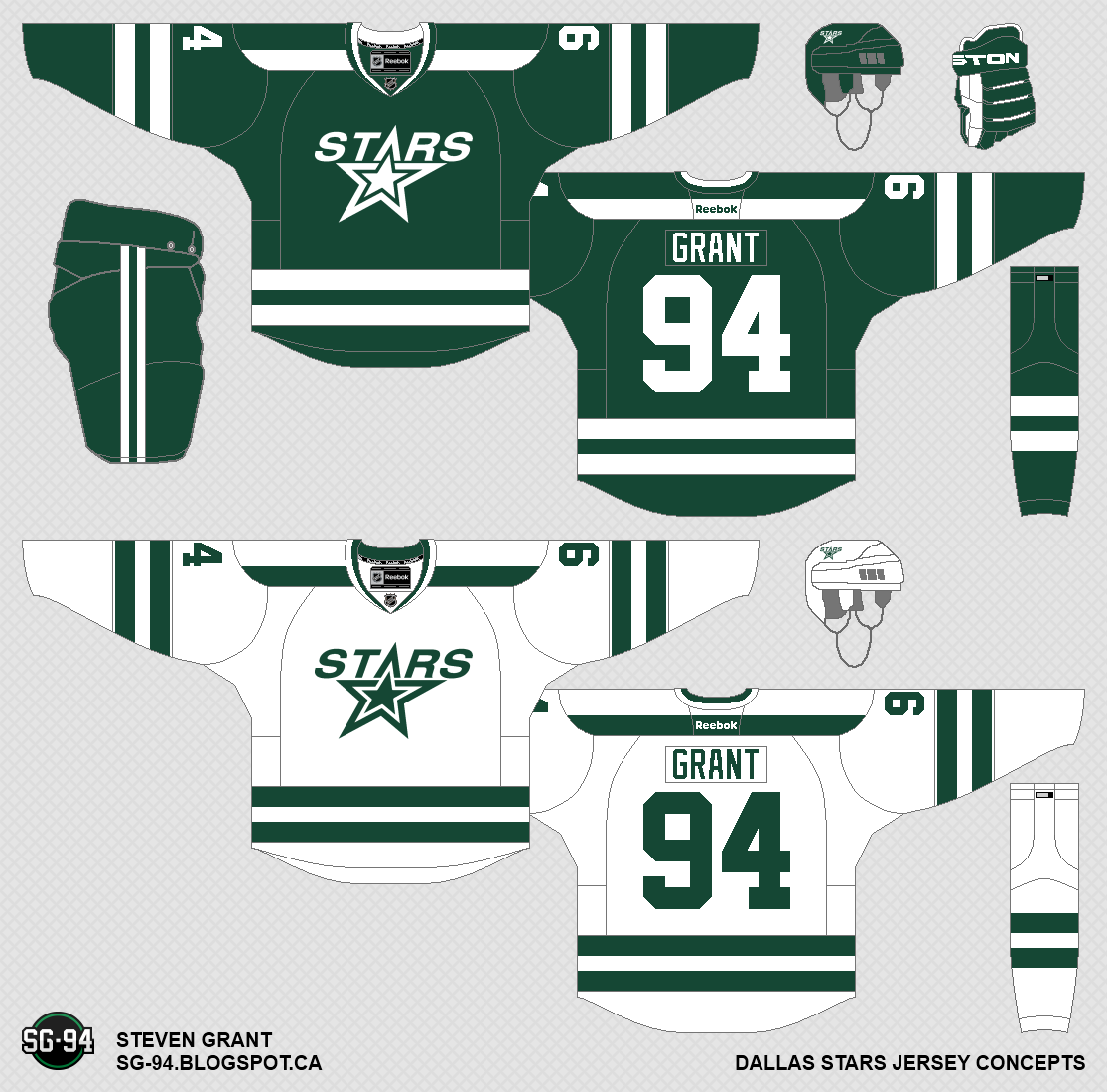
For Christmas 2011 I got a new Laptop, and downloaded Paint.net (previously I was using MS Paint).  I also added a double outline to my concepts, and started posting concepts to CCSLC.  This Stars concept was from January 2012.

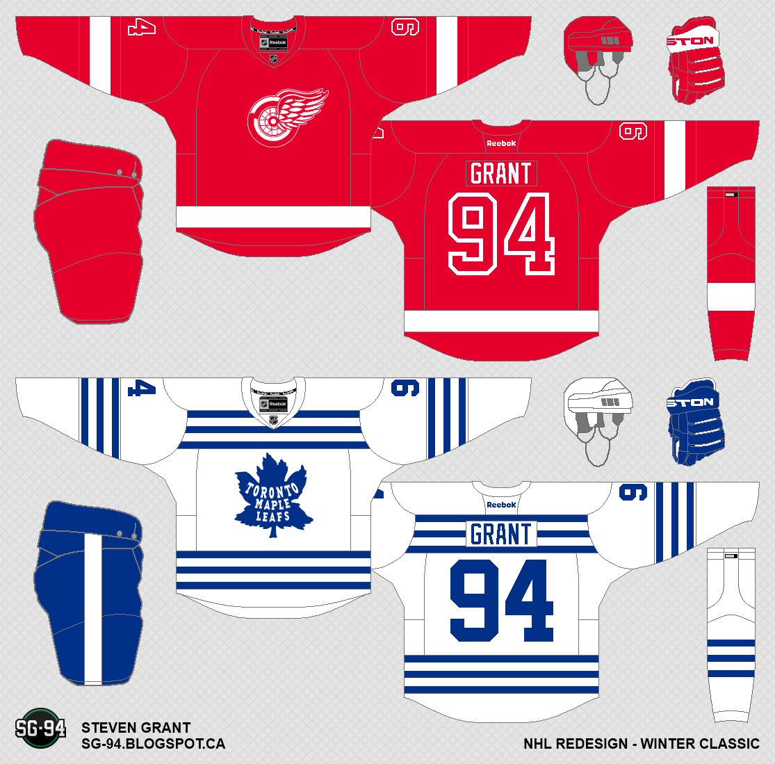
Most recently I started another NHL series, which I will complete, and I started this blog.  I hope you enjoyed reading about the history of my concepts.  The next NHL Redesign will be posted in a few days.

May 09, 2012

Ohio, Ottawa, and Philadelphia

I have one jersey left to make and then I'll have all the teams completed.  Don't know what I'll do next.  Anyways, here are the next few teams.

Ohio Nationals:  When I was trying to make a concept for the Blue Jackets, I had zero ideas.  That, combined with the fact that the Blue Jackets haven't really done anything positive in their franchise history, convinced me to rename them.  I was considering Ohio Nationals or Ohio Patriots, both for Ohio's patriotic service to their nation during the Civil War.  For the logos I took the Ohio state outline from the Cleveland Barons logo, and the star and stripes from this logo.  I designed the jerseys to look "American".  Was this a good idea or a bad idea?


Ottawa Senators:  The home and road both feature a barber-pole pattern, but this time they're sublimated.  I also used the side profile logo as the primary logo.  The third jersey is my take on their heritage jersey.  The bottom stripe is inspired by this jersey.

Philadelphia Flyers:  I brought back the Flyers 1982-2007 jerseys as the home and roads.  For the third jersey I wanted to keep the Flyers traditional stripe running down the sleeve, but I wanted a new design.  The result is a black jersey with an orange sleeve stripe.

The next teams in the NHL Redesign are Phoenix, Pittsburgh, and San Jose, but I have a different post coming before that.

May 04, 2012

New Teams (New York and New Jersey)

I'm almost done this series!!!  I only have to make concepts for Tampa Bay and Washington. If you have any ideas for those teams, leave a comment.

New Jersey Devils:  I didn't make any changes to the home and road because I really like those jerseys.  The third jersey is black, with arm and waist stripes inspired by 1982-92 white jersey.


New York Islanders:  I hope you like stripes, because the home and road have lots.  The four arm stripes are meant to represent their four Stanley Cup victories.  I also changed up the colours a bit to give it a more marine-like look.  The third jersey is orange and uses the word-mark from their current third jersey as the crest.

New York Rangers:  Only slight changes to the primary jerseys.  The biggest difference is that the road jersey now says "NEW YORK".  I brought back the Lady-Liberty jersey, but I curved the arm stripes and added hem stripes, along with a few other changes.

The next teams are Ohio (renamed from Columbus), Ottawa, and Philadelphia.

May 01, 2012

Wild Canadien Predators

As promised here are the next three teams in the NHL Redesign.  I'm almost done all the concepts for this series, with just a few teams left to complete.


Minnesota Wild:  In my opinion the Wild had the perfect set from 2003-07, so all I did was edgify those jerseys.  I know it's a boring concept but I think it's the best option.

Montreal Canadiens:  The home and roads are based off of their 1977-97 jerseys.  For the third jersey I used blue as the primary colour, with striping inspired by the home (without the chest-stripe).  You'll notice the logo in the arm-bands, which is inspired by their 1924-25 jersey.

Nashville Predators: I made minor changes to the home and roads, mostly removing the piping.  I then added a blue third jersey, which features a sublimated checkered-pattern in the striping.

Up next are the New York teams; the Devils, Islanders, and Rangers.