
----------------------------------------------------------------------------------------------------
Since we can't see the nominees for any votes, there are no voting reminders for me to post. Also the deadlines will probably have to be extended, I'm not sure.
----------------------------------------------------------------------------------------------------
Denver Nuggets (by Mike S.)

This concept is inspired by the actual Nuggets alternate uniform. I do like that fact, but I really think that this whole series is hurt by using nothing but wordmarks. Hockey jerseys don't normally use wordmarks, so these don't work as hockey concepts in my opinion. 6/10
CSKA Moscow (by Stephen T.)

The striping is really good, and the logo, which seems inspired by this logo, isn't that bad (besides being pixilated). There are a few execution errors, the shoulder yoke is different on one side of the front of the white jersey. Also the back of the collar on the white jersey is different than the front. 7/10
Minnesota Wild (by WinnipegJets96)

My only real comment here is that the jerseys are very traditional for a team with such a modern name and logo. They do look really good, but personally I'd rather see something modern. 7/10
Green Bay Packers (by Brian B.)

The Packers are a team that should use traditional jerseys (they've been around since 1919). These look actually like what I'd expect a Packers hockey jersey would look like, I have no complaints at all. 8/10
Los Angeles Kings (by WinnipegJets96)
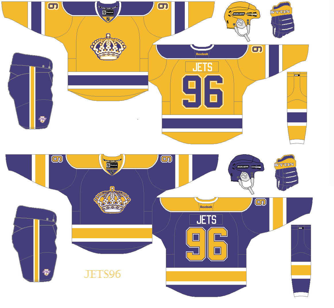
These jerseys look like a mix of the King's 1967-80 uniforms and their 1980-88 uniforms. I like these much better than the Kings current colourless uniforms (which I don't like very much). My only suggestions are to only use a single outline on the numbers, and move the logos up a tiny bit. Other than those minor issues, these a very good. 8/10
Chicago Blackhawks (by Kyle C.)

Even though I would never want the Blackhawks too change their jerseys, I love seeing concepts that do exactly that (when done well, like this concept). The striping looks great for an original six team, and it appears to be a modern version of the Blackhawks' old barber-pole jersey. Adding yellow to the striping really makes it "pop". Also the logo mash-up looks great. COTW nomination from me!!! 9/10
Santa concept (by Joey A.)

I just had to save this concept for last, I love the Christmas spirit shown here. The jersey itself looks very good too, I could definitely see a minor league team wearing this. My only suggestion is to have the rear hem-stripe (white) go all the way down to the hem to better match the front of the jersey. Take a look at the hem stripes on some of these jerseys if you don't get what I mean. 9/10
I'll second that nomination for Kyle.
ReplyDeleteI look forward to seeing your IIHF Re-design.
ReplyDelete